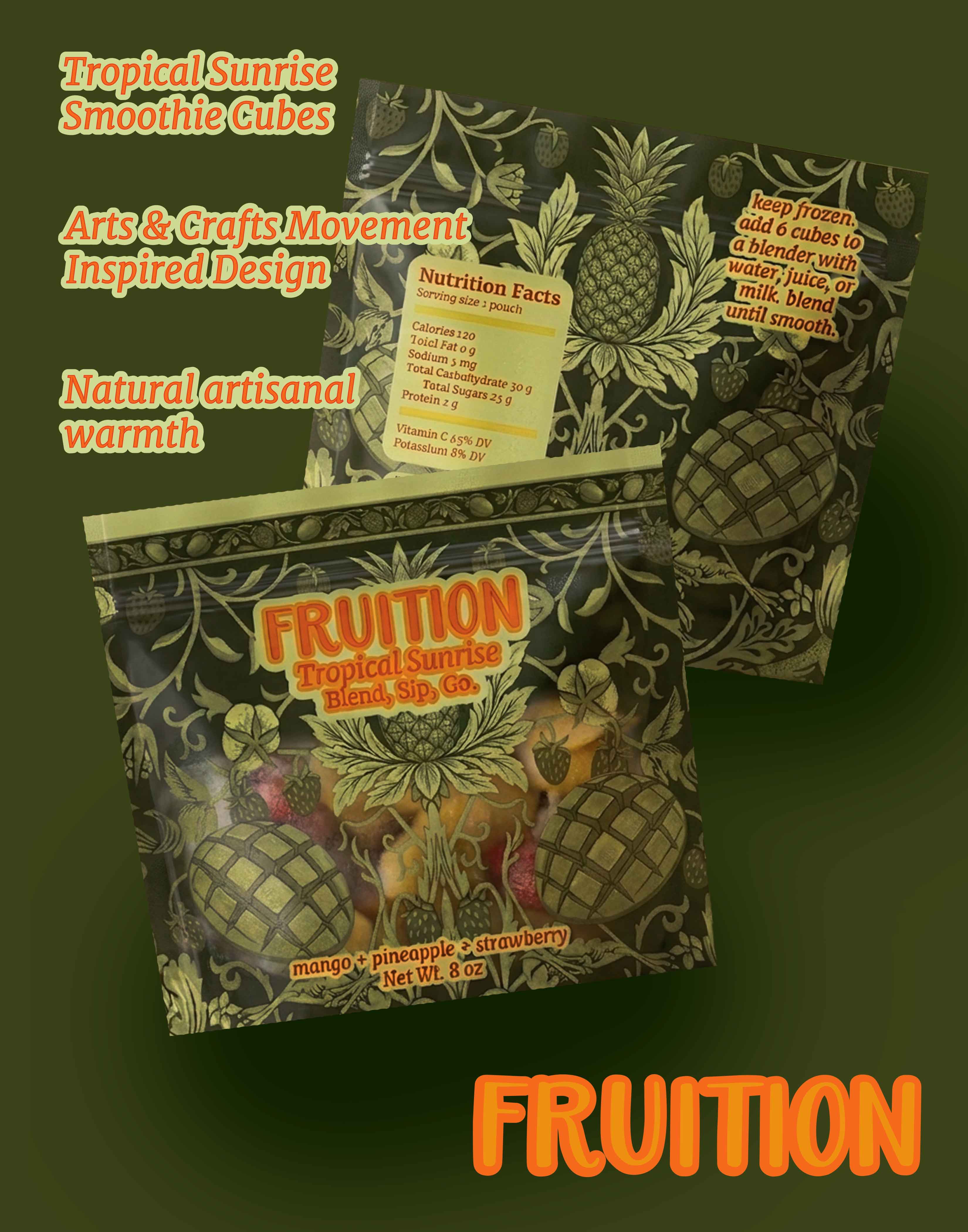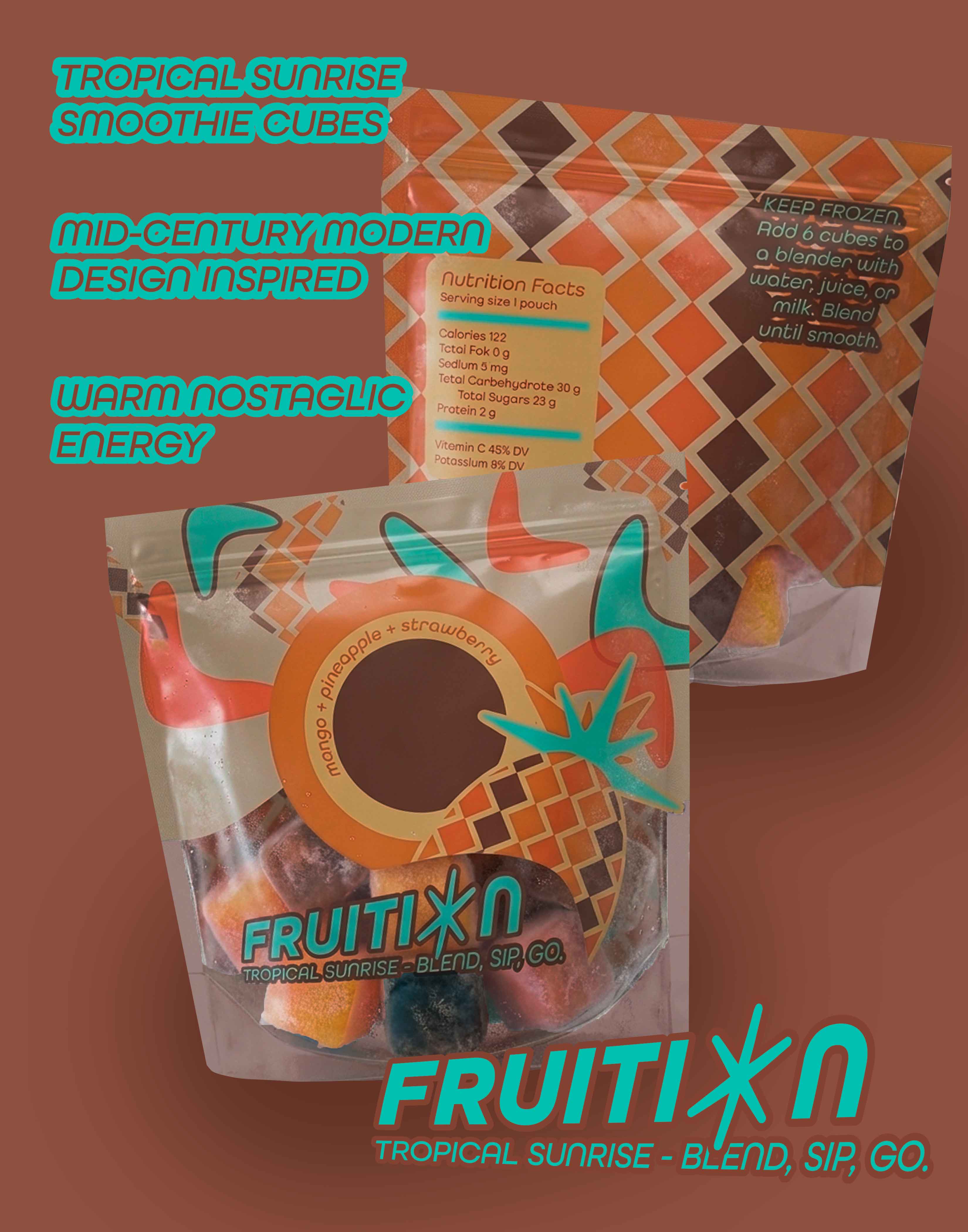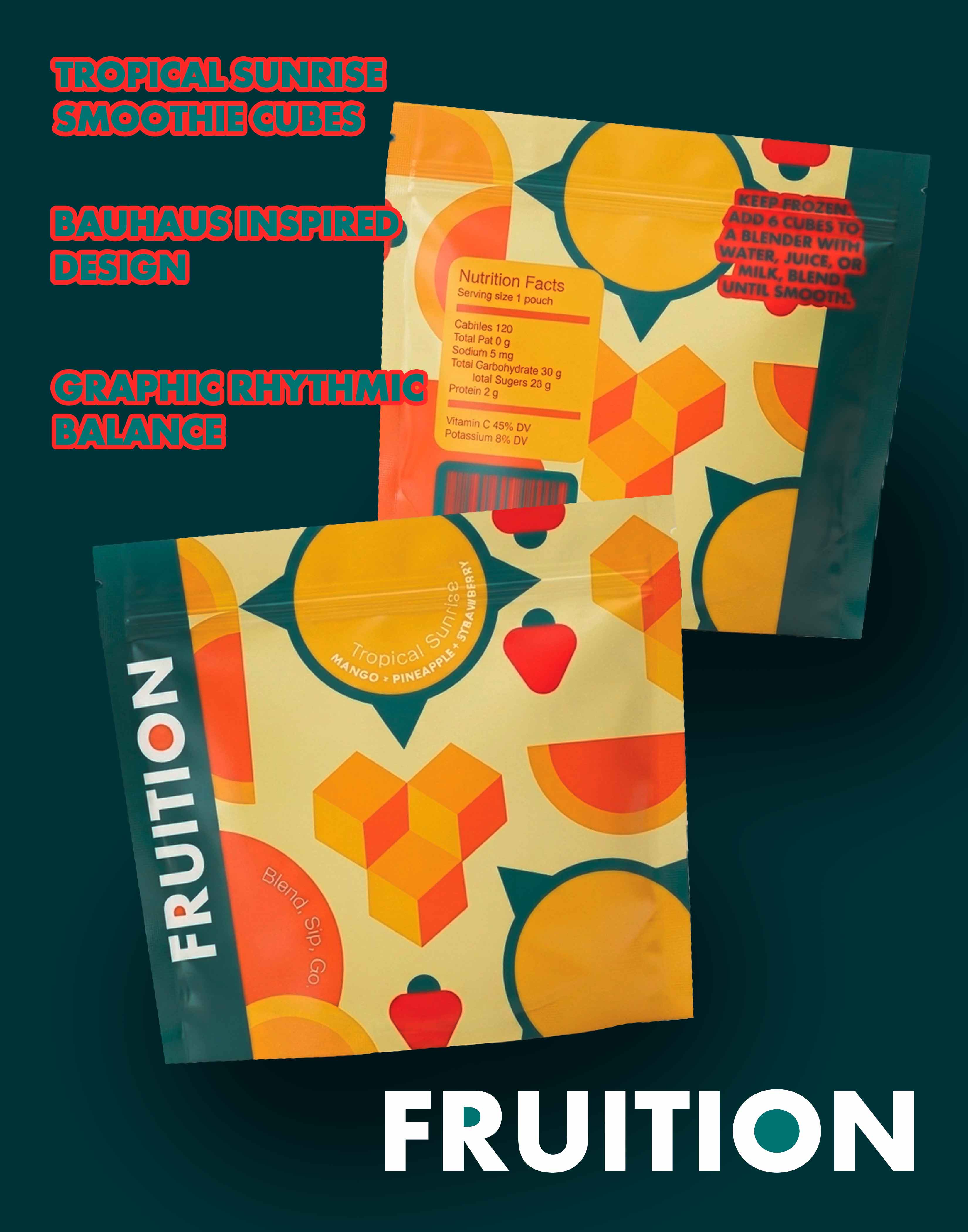
Fruition is a conceptual branding and packaging project for a frozen smoothie cube brand. The goal was to create a cohesive identity that felt fresh, modern, and visually rich while still feeling approachable for everyday consumers.
The challenge was to build a product brand that could feel unified as a single line while still allowing each flavor to stand out. The identity needed to balance visual personality with consistency across packaging so it would feel memorable at shelf level.
I developed the Fruition brand system from the ground up, including the logo, color palette, typography, and packaging structure. Each flavor explores a different art movement through color, shape, and composition, while a shared layout and visual language keep the collection connected as a recognizable brand family.
The final system feels creative and polished, with enough flexibility to support multiple flavors without losing the core identity. It communicates freshness, wellness, and visual storytelling in a way that feels distinctive and consumer-friendly.